This article is part of our Power BI series where we focus on sharing key features and insights associated with the tool. As we explained in more detail in another article, Power BI is divided into three different platforms, namely, Power BI Desktop, Power BI Service and Power BI Mobile. Today’s topic concentrates on the Power BI Service and one of its main features – the dashboard. Read on to discover how to create a dashboard in Power BI.
What is Power BI Dashboard?
We really like this definition of a dashboard by Data Flair:
“A dashboard is a canvas on which you bring different elements or visualizations representing datasets together.”
What we like about it is that gives a really objective summary of the nature of a dashboard. Firstly, dashboards in general are one page only, while reports consist of multiple pages. This means that dashboards can be part of reports to make them coherent and detailed.
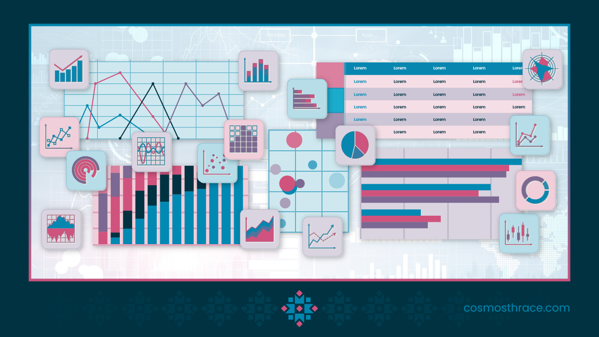
Added to this, the key aspect of every Power BI dashboard is the ability to represent data through different elements or visualizations. Those elements are usually charts and graphs which aim to highlight the most important parts of certain datasets. These visualization capabilities are the key feature that makes Power BI stand out from the pack.
Finally, the visualizations that are seen on Power BI Dashboards are called tiles. When creating a dashboard, you pin tiles from different datasets in order to create a complete and coherent canvas.
Key Steps on how to create a Dashboard in Power BI
- Importing the data
First, you will need to choose a dataset from which to import the data for your dashboard. This can be done by clicking the “Get Data” option and selecting a data source. Keep in mind that although Power BI supports a variety of data source modes, it still has some limitations. Check out this non-exclusive list of the most common data modes used for Power BI dashboards:
- Excel files
- CSV files
- Power BI datasets and data flows
- SQL databases
- Web services
- SharePoint lists
- Other cloud-based data sources or connectors
- Formatting and modeling the data
The data that you have chosen may need some further formatting in order to make it compatible with all the requirements of Power BI. For example, there may be some fields containing data, such as date, time, percentage value or currency. These might need some adjustments in order to be uniform. However, Power BI is usually able to automatically establish the connections between all the data tables in a data source. Whenever that is not possible or not accurate, you can do some further modeling of those tables from the Model tab in the app.
- Visualizing the data
Now the exciting part begins! Think of your report as a story. The visualization features of Power BI give you the opportunity to tell that story in an exciting and coherent way. So, the first step is choosing the right visualization types to represent the different data tables. Among the most commonly used visualization types are:
- Line charts – Line charts’ main purpose is to visualize continuous data over time. Their intended purpose is to show the trends between two or more variables.
- Bar charts – Bar charts are suitable to compare two categories or values. You can plot them horizontally or vertically.
- Tables – You can use tables to display exact quantities. Unfortunately, they are difficult to analyze, and this type of data chart is not often used.
- Heat Maps – Heat maps serve best to display the relationship between two variables. However, they are often utilized for geographical representations of data. The analyst can observe how cell colors change across each axis to find patterns and trends.
- Scatter Plot – Best for displaying values for two variables from a dataset and observing their overarching relationship. This is often used alongside line charts to quickly identify trends and correlations.
- Appearance and formatting
Once you have chosen the appropriate visualization types, you can customize their appearance and formatting. You can do that by going to the “Visualization” tab of the dashboard and editing relevant parts of your charts, such as Title, Color, Legends and Axis.
It is important to have a dashboard that is aesthetically pleasing because those small details can make your overall story exciting. We all know that the human attention span is becoming shorter and shorter. Impactful presentation and formatting can make your dashboard stand out.
- Finishing touches and publishing the dashboard
Finally, there is still some more work to do before publishing the dashboard. You must ensure that the canvas’s overall aesthetics are in place. Keep in mind that aspects such as margins and spaces can have a huge impact on the readability of the data. Make sure that you set equal margins between all visual objects. Also, you can add some spacing to the objects to emphasize.
Once you complete all those minor details you are ready to publish the Power BI dashboard. You can either publish the dashboard on the web or share it with your team members. Sharing the report with other people is important as you can gain valuable feedback and information regarding the readability and usefulness of your work.
Next steps
Okay, now you know how to create a dashboard in Power BI. However, those dashboards can take many forms and serve different purposes. Check our article to discover some of the most interesting dashboards found on the web.